

Edited By Toby Maxwell
FROM LATE-NIGHT LOUNGES to rooftop terraces, the bars and leisure sector remains one of the most expressive – and experimental – arenas in commercial design. In this special focus, we explore a series of standout projects that showcase how bold spatial thinking and atmosphere-led design can define not just a venue, but the whole visitor experience.
Often, it’s here that the most daring ideas emerge; where designers push boundaries with colour, materiality, lighting and narrative. These spaces are testing grounds for concepts that ripple out into residential, workplace and wider hospitality schemes too.
Through detailed case studies and conversations with the creatives behind them, we unpack how these projects were conceived, challenged and realised. From immersive storytelling to smart planning, this is a sector that rewards bravery. When freedom meets function, the results can be extraordinary.
1 – Interview
Lee Roberts, Zebra Projects
Lee Roberts, creative director at Zebra Projects, explains how the studio approaches bar and leisure design – from early client dialogue to balancing guest experience with operational needs across diverse global contexts…
Zebra has delivered many high-impact and diverse leisure and bar spaces. What’s your design approach when starting a project in this sector?
It has to start with the guest. We work closely with our clients to create an experience that is right for the guest profile, one that is unique, memorable and tailored to the offer. The overall design needs to balance brand storytelling, sense of place, aesthetics and operational functionality. To create a design solution for an extraordinary brand experience, the client’s vision is a very important place to start, followed by market research and insights. Typically, the research we undertake on the location or site feeds directly into the style and design of the project; in turn, this makes the solution speak directly to the space within which it resides.
Bar and leisure schemes demand both atmosphere and efficiency. How do you balance the guest experience with practical requirements like staff flow and service functionality?
It can be an evolving process during the design stages. We will progress through several phases of layout from test fit to schematic, which can also evolve during the concept design stage, as the menu offering can morph and, as a result, the design narrative develops. We strive to focus on the guest experience as primary – however, functionality or operations is key for the overall package to be successful. There can be times when compromises must be made – however, in the event a seating configuration, or the guest perceived view is affected, we strive to make this a special focus to never have a bad seat in the house!
What current trends are shaping your work in bar and leisure design – whether in terms of materials, spatial layouts or guest expectations?
Guest expectations are rightfully higher today than they previously have been, which we think is a very good thing. As designers we want to be challenged and strive to create better solutions for both guests and the operational teams. Spaces are now multi-functional and cater for a greater degree of experience or activities. Hospitality, retail and the workplace are becoming one, as we all expect our spaces to cater to more needs, in a harmonised way. Brand or space storytelling, interactive digital content, sensory layering, flexibility and, of course, sustainability are key areas currently.
Sustainability is becoming a standard expectation. How do you embed sustainable choices into the design and delivery of your projects?
We feel this needs a holistic approach that doesn’t just focus on material specifications. At Zebra, we have sustainability champions in each of our offices that continuously keep up to date with innovations and ensure all our teams are informed and connected globally to take best practices from around the world. As part of this in-house initiative, we have extensive research libraries that allow us to quickly and effectively embed sustainable practices into our projects.
Zebra operates globally on projects such as the fast food restaurant chain Shake Shack. How do you ensure each project reflects local culture and context, while still maintaining the consistency and values of the brand?
Shake Shack always intend to enrich the neighbourhoods in which they open and be an accurate reflection of the local community. Each Shack is designed in a way that is unique to the location, this includes a strong sense of place and narrative to inform all the interior design elements, specifically partnering with local artists and creating new menu items. There are a range of core branded elements that relate to the brand’s origins in Madison Square Park NYC – we synergise this with bespoke design elements to reflect the narrative for a coordinated offering globally.
How do you engage with clients and operators at the early stages of a project to ensure their vision aligns with what’s deliverable in design terms?
Open and honest dialogue at the start of the project is key to creating a clear shared vision of the objectives of the project or space. Of course, cost forms part of that conversation – however, design does not need to be controlled by budget. As the designer it is our responsibility to create a physical version of the vision regardless of budget and create an experience that is memorable for the guest. Based on research and insights we prepare a series of routes/design solutions to discuss with the client to ensure ‘buy in’ throughout the process. We always strive to be an extension of the in-house team and see the relationship as a partnership throughout.
With many projects tied closely to brand identity, how do you create spaces that are distinctive and on-brand, without falling into a formulaic approach?
Each brand has a different story, a different origin, and a different vision; therefore, we design specifically for that brand and/or space. We intentionally do not have a house design style as we believe each project and client is unique and the design solution should reflect this discussion. ‘Design that Connects’ is not simply a tag line, it is something we abide by, connecting across our teams and offices, connecting with the client and above all else connecting with the guests to create extraordinary brand experiences globally.
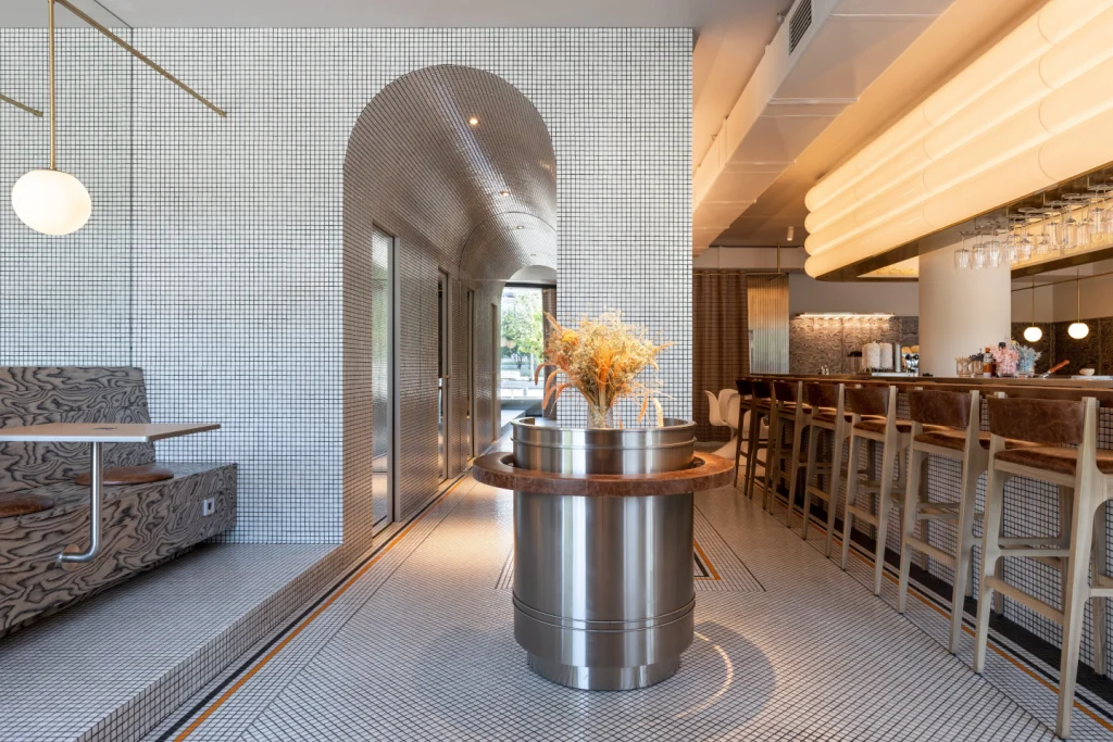
Project
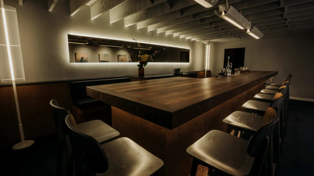
Jack’s Bar & Grill, Dubai
JACK’S BAR & GRILL at Dubai International Airport’s Terminal 3 combines rustic charm with a luxurious twist. Inspired by Jack Daniel’s, the establishment now features a revamped design by Zebra that aims to provide travellers with an elevated bar experience that merges retail and casual dining.
The bar, illuminated by Jack Daniel’s signature amber glow, offers a variety of cocktails, draft beers, spirits, and wines against a striking backdrop. Guests can choose to dine, drink, or do both, with high-level seating options catering to those on the go. The atmosphere radiates sophistication and warmth, blending marble tabletops with charred wall panels for a contemporary rustic ambiance.
The sustainability aspects of Jack’s Bar & Grill are energyefficient lighting and locally sourced materials, including versatile furniture that is locally manufactured in the UAE.
The bar’s interior design aims to seamlessly blend tradition with modernity. Custom-built joinery optimises space utilisation while adding a contemporary flair. Innovative custom-designed bottle rack partitions are integrated with LED lighting in an amber orange to elude the shape of the Jack Daniel’s bottle and create an interesting view from both the inside and the outside of the bar. Another innovative custom light feature, is the amber neon rope light swirling from the ceiling, representing a whiskey swirl as it is being poured into the glass. The bar and grill has also been laid out to seamlessly integrate a retail space for Jack Daniel’s merchandise to be sold, a rare feature in a bar and grill.
Another neat function considered in the design is the booth seating, which is the exact height of a cabin suitcase, so that it can sit neatly and safely alongside the booth while the customers dine.
Project
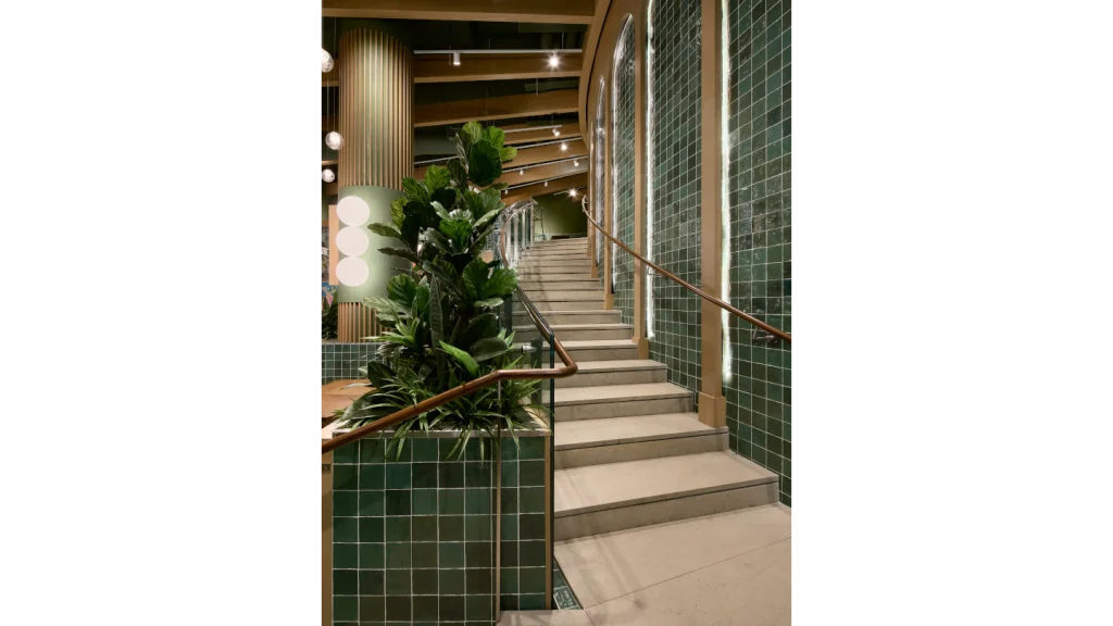
Shake Shack, Toronto, Canada
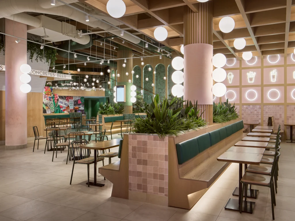
SHAKE SHACK CANADA sits within a 13-storey complex, spanning over 6,700ft2 of space across two floors. As part of the brief, the client wanted to combine the traditions of the local area with a modern, fresh aesthetic. Zebra explored this scheme concept by referencing the elegance of a bygone, theatrical era and blend it with a modern culinary feel.
The design by Zebra features an opulent fusion of heritage and modernity, with brass accents, vintageinspired details, and a rich colour palette that evokes the ambiance of classic theatres. The décor includes dramatic light bulb signage and sconces that cast a warm, inviting glow, ensuring customers enjoy an inviting atmosphere.
Shack Shake Canada is situated in The Tenor, a spectacular 340,000ft2 retail, office and entertainment complex located at the bustling intersection of Yonge and Dundas Streets in Downtown Toronto. This prime location is at one of Canada’s busiest spots, drawing over 100,000 visitors daily and is a central hub for public events, performances, and art displays, a prominent landmark and top tourist destination in Toronto.
The Shack celebrates the rich theatrical history of the area, drawing inspiration from legendary local venues such as the Ed Mirvish Theatre, Coronet Theatre, Elgin and Winter Garden Theatres. The new Shake Shack captures the timeless allure, providing guests with a unique dining experience that honours the rich cultural and architectural heritage of the neighbourhood.
When designing, Zebra felt it was important to incorporate local materials to reduce carbon usage and support local manufacturing. The wooden tables were made using locally sourced Canadian wood and crafters. Each individual table is embossed with ‘made in Canada’ to further evidence this to visitors.
The Yonge and Dundas location is a thoughtfully designed space that reflects the city’s spirit while staying true to Shake Shack’s distinct aesthetic. Shake Shack partnered with local Toronto artist, Briony Douglas, who created an art installation to launch the brand in Toronto and bring a burst of creativity to the heart of the city. www.zbr.global
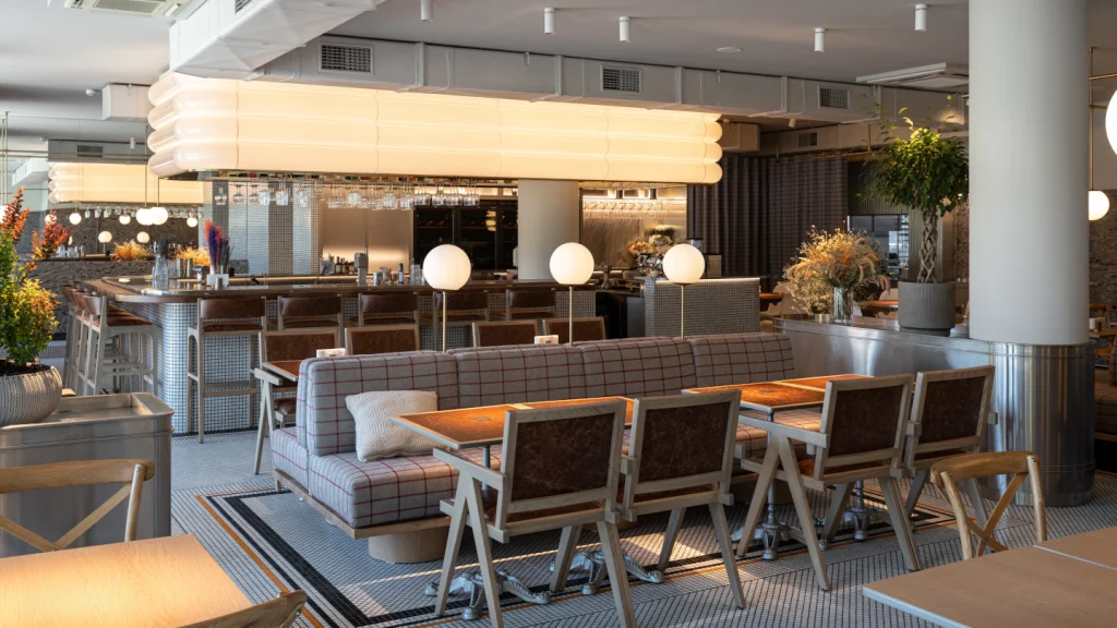
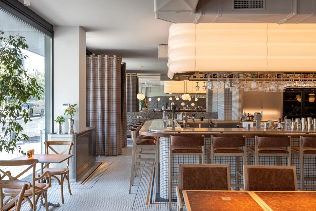
2 – Interview Leanne Armstrong, Black Ivy Design

Leanne Armstrong, founder of Black Ivy Design, shares how texture, lighting and art deco flourishes were carefully layered to transform a basement bar into a rich, immersive hospitality experience…
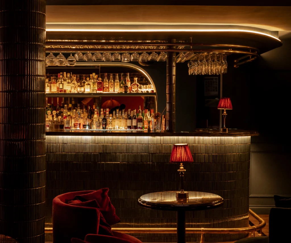
The brief for Hush was to evoke the glamour of the 1920s while maintaining a contemporary edge. How did you interpret that balance through your material and design choices?
We chose curved art deco shapes/lines and mirrored this through the bar, fixed seating, and created booths with curved structures, and incorporated art deco-inspired wall coverings and glass sconces. We also specified a chenille Arte wall covering adjacent to the bar, which complemented the space beautifully and is a wow effect as guests approach the bar.
We also wanted artwork to reflect the time of the 1920s. We purposely kept all fabrics deep, luxurious textures – in plain colours so artwork really stood out and took centre stage. We wanted a luxurious feel and chose deep reds and navies, keeping lightning atmospheric and reminiscent, and reflective of the speakeasy-era of hidden bars.
The basement setting came with clear spatial constraints – particularly the low ceilings. How did those limitations shape your design strategy?
As a designer, I have to embrace limitations. We love a challenge and when faced with issues, like low ceilings and limited space, it really pushes us to think outside of box. We had so much fun layering and playing around with light and shadows. We specified tiles on fireplace and pillars and loved how these reflect light. We had to get creative on back-end items such as AC and ventilation to avoid the main areas, which certainly was a challenge.
Lighting plays such a critical role in the Hush experience. Can you talk us through the development of the layered lighting scheme and how it influenced the mood of the space?
We wanted to create light and dark to give space personality. We used fluted glass, lamp shades with tassels to create movement and effects with light. We initially started off with more wall lights but gradually decreased to add intrigue.
Texture is also a defining feature of Hush’s interior. How did you curate the tactile palette, and why was it so important to the overall concept?
We wanted texture at every turn to evoke emotion. We had repetition of cold mosaic tile on the bar, fireplace and pillars, contrasting against soft velvets, chenille and woven fabrics. We designed bespoke tub chairs with the idea that guests would sink into seats when they sat down and wouldn’t want to move for the evening, increasing dwell time and spend. This concept – complemented by the lighting – creates a warm and inviting space.
You have woven art deco elements subtly throughout the scheme – from lighting to furniture detailing. How did you avoid pastiche while still honouring the era?
This was something we were very conscious of as this can be a fine line. We wanted to create a unique space that both gave a nod to the era but in a quirky way that never imitated it. This was filtered in subtly by weaving in beautiful wall coverings and fabrics by Divine Savages, Anna Hayman and House of Hackney, who are renowned for its stylised art deco designs. Using velvet and tassel pendants gave perfect art deco nods and complemented the design without being too cliché.
Hospitality clients are increasingly asking for ‘experiential spaces’. How do you define that in design terms – and how do you deliver it without sacrificing function or longevity?
There are many speakeasies but none that offer quite the experience of Hush. Guests are having fewer nights out but when they do venture out, they want to make most of it. Adding in focal points, tactile surfaces, relaxed atmospheres, they want to be wowed by powerful scenes.
It’s not always just design. Service, delivery and menu all play a part too. If all these touchpoints can meet, it’s sure to be a success. We focus more on delivering guest experiences through truly humancentric design. We love how a space influences human behaviour – we always start our design process by asking ‘how do we want guests to feel in this space?’, ‘how do we want guests to interact in this space?’, and ‘what experiences do we want to have?’
Function must always come first – anything can be designed around what client and guests require as a basic need. We always start with that a basis and build around that – and then that’s when the real magic happens.
Project
Hush, Warwickshire
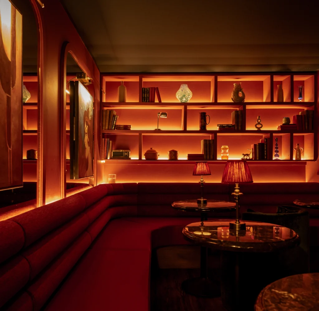
IN A QUIET CORNER of Warwickshire, Hush is a new Project speakeasy-inspired private members’ club developed by Leam Properties. Nestled in a basement by the River Avon, the new bar exudes the glamour and intrigue of a bygone era. With interiors crafted by Black Ivy Design, the venue merges the decadence of the Roaring Twenties with the understated sophistication of modern luxury.
As well as a stylish bar, Hush aims to deliver an immersive hospitality experience. From the moment guests descend into the low-lit, velvet-lined space, they are transported to an era of jazz-filled nights and clandestine gatherings. The design’s art deco inspiration is clear, but with a very modern twist. ‘The client envisioned a space that would capture the spirit of the 1920s, but with the refinement and comfort of today,’ says Leanne Armstrong, founder and creative director of Black Ivy Design. ‘We wanted every detail to feel intentional, every element to tell a story, and the result is a space that feels intimate yet spectacular.’
The transformation of the basement space was no small feat. Its low ceilings and riverside location presented challenges, but these constraints sparked creativity. Over nine months, the team reimagined the space, crafting a venue that feels atmospheric and entirely transformative.
Central to Hush’s allure is its lighting design; a carefully orchestrated element that enhances the club’s ambiance. The low ceilings, initially seen as a limitation, nudged the design towards a layered lighting scheme that creates depth and drama. A mix of uplights, hidden LED strips, wall sconces, and statement pendants work together to cast a warm and inviting glow.
The pendants, sourced from Anna Hayman Designs, are a standout feature. Their soft radiance complements the golden tones of table lamps, while fluted glass fixtures ripple light across the space, nodding subtly to the art deco aesthetic. Armstrong adds: ‘The lighting became the backbone of the mood. We wanted guests to feel cocooned, like they’ve stepped into another world.’
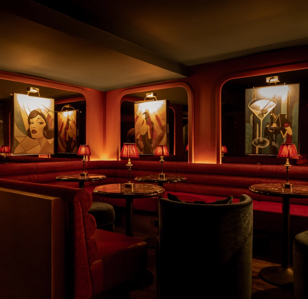
Beyond the lighting, texture plays a leading role in the design. Walls and furnishings are draped in velvet, while deep reds and navy blues create a rich, enveloping palette. Art deco-inspired patterns are woven into the space, from the upholstery to subtle details on the furniture, while chenille wallcoverings and fluted accents add depth and refinement. www.blackivydesign.co.uk
3 – Project
Ministry of Breakfast, Nizhny Novgorod, Russia
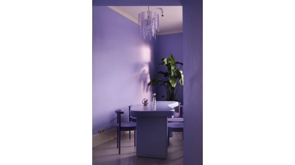
A HISTORIC 19TH-CENTURY building has been reimagined into a vibrant and welcoming Ministry of Breakfast café, offering a unique experience for guests. Located in a building adorned with green-painted caryatids on the façade, the project aims to evoke a sense of whimsical elegance.
The interior design was guided by a clear vision to harmoniously complement the venue’s bold branding, and transport guests into an alternate reality of ‘ministerial soirées’. The lower level serves as a ‘portal through the looking glass’, with deliberately distorted wall paintings, unusual furniture arrangements, and muted lighting that enhance the immersive experience.
On entering the space, guests are greeted by colourful diamond-patterned terrazzo flooring, which flows seamlessly into the vestibule – a cosy closet that frames the gateway to this striking area. The café’s design features vivid sequences of dazzling colour, clashing patterns against light-coloured backgrounds, and intricate decorative elements intended to keep the atmosphere fresh and dynamic. Posters within the venue proudly showcase a breakfast motif, reinforcing the café’s primary identity as the ideal spot to start your day.
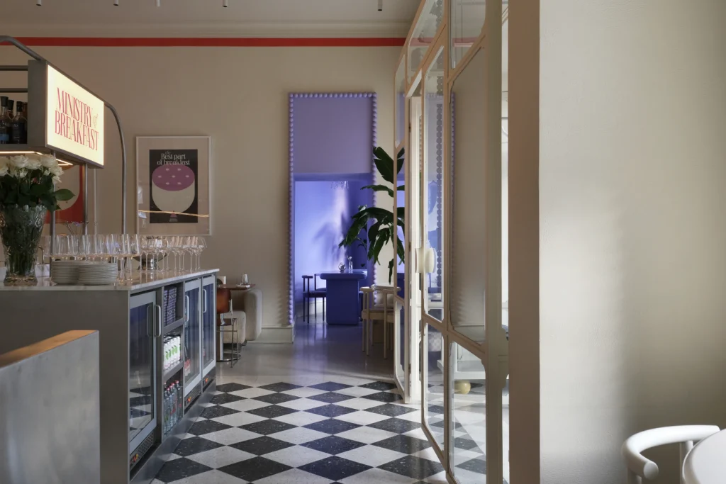
The carefully selected colour palette helps create a warm, inviting atmosphere throughout the space. The entrance area boasts a versatile lavender shade and a complementary cream hue, offering an idyllic setting for guests to enjoy breakfast. Meanwhile, the first floor is designed with soothing pastel tones, contrasting with the basement’s more vibrant ambience. Dark purple stripes stretch from the centre of the ceiling down the walls, guiding guests around entrances and round light fixtures, while a mirror in a light-refracting frame creates reflections across the room.
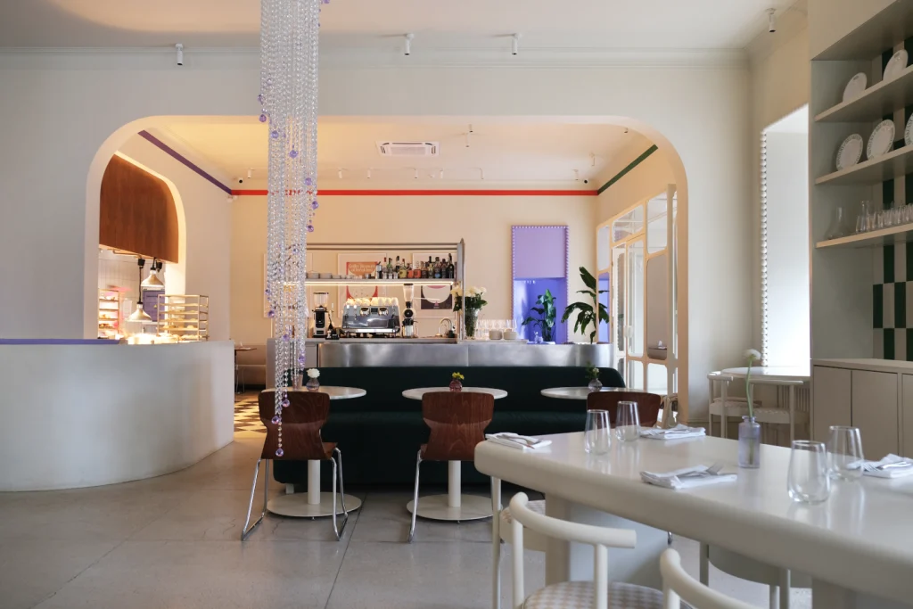
Among the distinctive features are the beads adorning the frames of the apertures, towering cabinets with carved tops, and the unique chequerboard pattern inside the cabinets. A crystal chandelier spirals downward from the ceiling, casting a light that adds to the venue’s charm. www.studioshoo.com
4 – Project
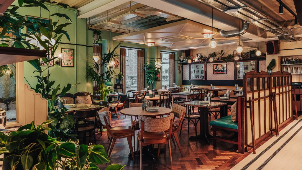
Boxhall City, London – Macaulay Sinclair
THE RECENTLY OPENED Boxhall City represents a new design chapter for Boxpark, which will see the brand focus on transforming heritage buildings into hospitality hubs. Interior architecture and design studio Macaulay Sinclair is behind the design concept that has shaped the new venue, which is the first new dining concept from the creators of Boxpark since 2011.
Departing from Boxpark’s iconic shipping container-based venues, Boxhall City will focus on repurposing existing heritage and industrial buildings, offering a contemporary food hall experience. The 800-capacity social dining venue is located in the historic Metropolitan Arcade, adjacent to Liverpool Street Station. Macaulay Sinclair’s design vision for Boxhall City prioritises the preservation of the arcade’s rich heritage, which originally opened in 1912. The Edwardian shopping arcade, built on the site of the former Metropolitan Railway station, features a striking 100-yard long and 18ft-wide glazed roof.
Mike Sinclair, director at Macaulay Sinclair, says: ‘When it comes to heritage sites, we have a deep understanding of how to develop designs that are respectful of the building’s history while still creating a dynamic and engaging dining environment. The structure of the arcade naturally dictated the arrangement of 13 kitchens and two beer halls, with communal seating flowing beneath the spectacular glazed roof.
‘Important features have been meticulously preserved and showcased, including exposed steelwork beams and columns, original concrete flooring and ceilings, and original timber shopfronts, which have been adapted into kitchen frontages. The stand-out feature is undoubtedly the linear arcade space and its grand canopy.’
The design palette, predominantly monochromatic, features black gloss flooring, concrete tile kitchen counters, blackened steel detailing, black-stained timber panelling, and industrial-style lighting, offering a refined industrial aesthetic.
The two beer halls offer distinct experiences. Beer Hall One boasts a mix of banquette seating, high-level communal tables with stools, and loose tables and chairs within a tall-ceiling space, complete with painted-out black exposed services. Beer Hall Two features dining-height communal tables and bench seating in a low-ceiling space for a more intimate atmosphere.
Sinclair adds: ‘Boxhall City represents a new chapter for Boxpark, focusing on transforming city centre locations with a focus on heritage. We’re proud to have contributed to this unique project, blending historical elements with a modern dining experience.’
Phase one of Boxhall City, which encompasses a 14,000ft2 street-level site, opened in April with work now starting on phase two to add a 3,000ft2 rooftop terrace bar, anticipated to open later this year.
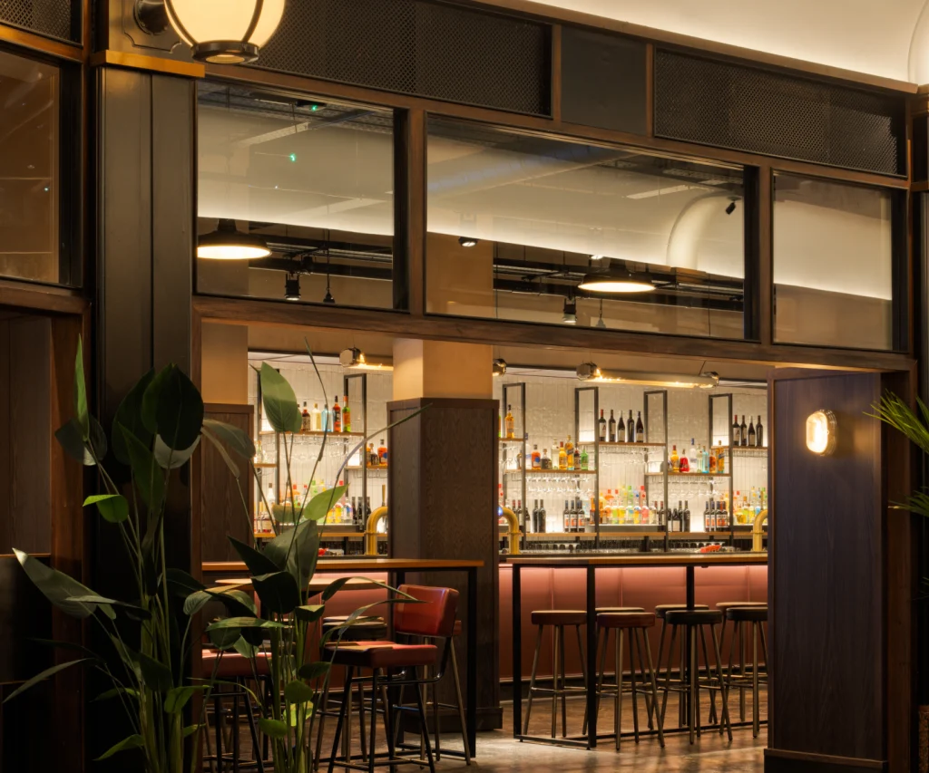
Project
Permit Room, Oxford
MACAULAY SINCLAIR recently collaborated with the Dishoom team on the third venue of its sister brand Permit Room with a design concept to immerse visitors in the vibrant atmosphere of mid-century Bombay.
The studio wanted to ensure an authentic and immersive experience. From hand-selecting furniture from Mumbai’s markets and bazaars, to adding texture and character through exposed ceilings and walls, the existing empty, concrete shell was transformed into a space bursting with character, intrigue and style.
Although not a heritage building, it was decided to retain some of the existing rough fabric for a backdrop to the fit out. Hence, exposed ceilings and unplastered walls add texture and character.
Other attention to detail adds to the overall effect too, with music taking a central role in the Permit Room experience, referenced across the wall art and through the inclusion of a DJ booth, which hosts both local and South Asian DJs on the line-up. www.macaulaysinclair.com
5 – Project
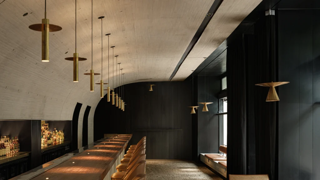
Above Board, Melbourne
TUCKED AWAY IN a graffiti-laden alley above a beer and bottle bar in the Collingwood district of Melbourne, Australia, Above Board offers an unassuming haven of elegance away from the hustle and bustle of the streets outside. The bar subscribes to an ethos of ‘simplexity’ – the interplay between simplicity and complexity – that extends beyond the drinks menu into the very structure of the bar itself.
Above Board is the vision of renowned bartender Hayden Scott Lambert, who, alongside co-founder Manu Potoi, sought to create a bar that strips away distractions, placing hospitality at the forefront. ‘I wanted to design a space that placed guests at the heart of the experience,’ says Lambert. ‘Every decision was made to enhance the flow of service, eliminate inefficiencies, and create an atmosphere where our craft as bartenders could be truly appreciated.’
At the core of Above Board’s design is a central, cockpitstyle bar station – an ergonomic showpiece that ensures every necessary tool and ingredient is within reach, allowing staff to serve up to 16 guests seamlessly. Inspired by the precision of a chef’s table, the bar is a stripped-back, highly functional space that serves as the focal point of the guest experience, with minimal distractions.
‘I think of Above Board’s design in two parts, much like a Rolex watch,’ says Lambert. ‘The bar top is the watch face: elegant, minimal and refined. Beneath it, the bar station is the movement: an intricate, hidden mechanism that allows the experience to function seamlessly, with absolute precision.”
The console is framed by a striking 5m American black walnut bar top, resting on a warm cork-tiled floor sealed with beeswax for both aesthetic appeal and acoustic absorption. The deep wood grain shifts subtly under changing light to display warm amber tones, while a smoky mirror spanning the wall behind the bar expands the sense of depth without intruding on the space. Custom-made lighting, framed by a white-painted corrugated metal ceiling, is the finishing touch on the space, reinforcing Above Board’s ethos: every element has purpose, and nothing is superfluous.
Beneath the bar’s elegant facade lies a hidden infrastructure designed for peak efficiency. A black Formica console – completely out of sight from guests – houses every tool, ingredient, and appliance within arm’s reach. Softtouch drawers conceal the mise en place, while essential elements like the ice freezer, glass freezer, dishwasher, and sink are precisely positioned for a fluid, uninterrupted workflow. Even bottles themselves – often a visual centrepiece in many bars – are absent from sight. Instead, Lambert opted for empty and stripped Hibiki whisky bottles as uniform decanters, chosen for both their visual form and their deeper meaning: ‘Hibiki translates to resonance, and that felt right. A great bar experience should resonate beyond the moment, leaving something lasting with the guest.’
For those fortunate enough to sit behind the bar, Above Board’s banquette booths offer a unique vantage point. Wide enough only for two guests each, the custom-built benches with pull-out tables hidden beneath provide a rare behindthe- scenes view, allowing guests to witness the choreography of service up close. ‘This feature turns a seat at the bar into a front-row experience,’ Lambert adds. ‘You see the “gears” in motion while still feeling part of the atmosphere.’
Everything about Above Board’s design was built to create a show and, ultimately, an elegant, intimate space where less is more, and where form meets function. The result is an efficient, innovative cocktail bar that offers a fresh perspective on what minimalism can be in hospitality. The goal was simply to make a space that worked flawlessly while feeling effortless. Above Board set a new benchmark, and Lambert is ‘proud to see its approach to “simplicity with complexity” and symmetry inspiring a new generation of bars around the world’. www.aboveboardbar.com
6 – Project
House of Gods, Glasgow
FOLLOWING A THREE-YEAR renovation, the striking luxury hotel House of Gods has opened in the Glasgow’s Merchant City location. Occupying the corner of Glassford and Wilson Streets, the venue offers six more rooms than its Edinburgh counterpart, including a new room category that comes complete with four-poster bed and golden bathtub, as well as two presidential suites located on the hotel’s top floor, complete with private cinemas, expansive ensuites kitted out with twin baths and sprawling his and hers shower room, as well as the option to reserve the whole floor.
Even aside from the super-premium spaces, the interiors throughout aim for the highest standards of luxury, from handpainted 24 karat gold embellished de Gournay wallpaper in the lobby bar, to the marble fountain crowning the rooftop bar.
On the top floor is the new rooftop Garden of Eden-inspired restaurant and bar. The space serves an all-day menu along with expertly mixed cocktails against a backdrop of city skyline views. www.houseofgodshotel.com
7- Project
The Whisky Bar, Taiyuan, China
LOCATED IN Taiyuan, the capital of Shanxi Province in North China, this project consisted of the refurbishment of two floors of a commercial podium, part of a standard real-estate housing complex. The scope of the intervention extended on the area of three existing shops and aimed to unify them into a single whisky and cocktail bar. The space, mainly facing the main street, also has a discreet access from the back to a pedestrian commercial street.
Due to the presence of an apartment building on top, the space was heavily constrained by the structure, with loadbearing walls slicing up the space into small entities, as well as various pipes and shafts crossing the space from side to side.
Facing the significance of the existing building, the work on the façade was essential to allow the new project to ‘fit’ in the cityscape. Design and architecture studio JSPA chose to remove all existing façade claddings and to recreate a new facade that would oppose the usual light cladding of commercial facades. They worked on a cast-inplace concrete façade that will assert its presence in the context through its materiality. The concrete as a material allowed for a monolithic façade that brings a new texture into the city, and which also provides a long-lasting cover for the existing building.
The project development aimed to create a bar for the city, and a gathering place opened to its surroundings. To emphasise the orientation of the space towards the street, the bar area was covered with a concrete arch ceiling, a curved suspended slab cast in place, that also allowed to dissimulate the service spaces in the back and all the machinery and pipes from the existing building.
Focusing on a strong dialogue between the project and the city, the ground floor of the bar was conceived with a long concrete bench along the façade, usable on both sides, and a set of folding windows enabling the removal of physical barriers with the street.
From the first floor, a sculptural helicoidal steel staircase leads to the second floor, where the project develops into a more intimate ambiance. A system of steel shelves was developed to create subtle separations between spaces and generate intimate alcoves, while offering a showcase space for whisky bottles. Made from the boundless repetition of a single identical element, the showcase shelf created an interesting pattern that became the second strong identity element of the project.
To accentuate the alcove feeling, three of the independent spaces were covered by a concrete arch, wrapping the space from wall to ceiling and allowing the cast-in design of benches and fireplaces. The choice of the concrete came naturally from the idea of a long-lasting material that would age gracefully. On the first floor, it was combined with a grey brick flooring, which the tint and pattern would match with the wooden cast concrete of walls and ceiling.
The brick floor is also intended as reflection of public space and narrows the distance between the bar and the city. By contrast, all of the elements requiring direct contact from visitors were made of warm materials – for example, the bar surface made of oakwood, and the bench seats covered with leather – to enhance the sensorial experience of visitors. www.jspa.fr
8 – Project
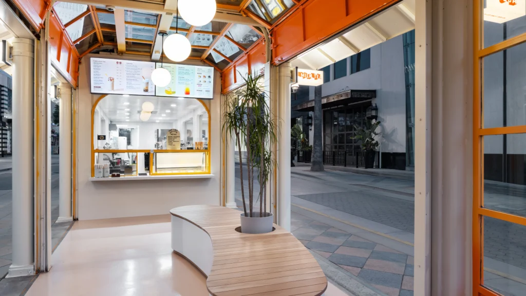
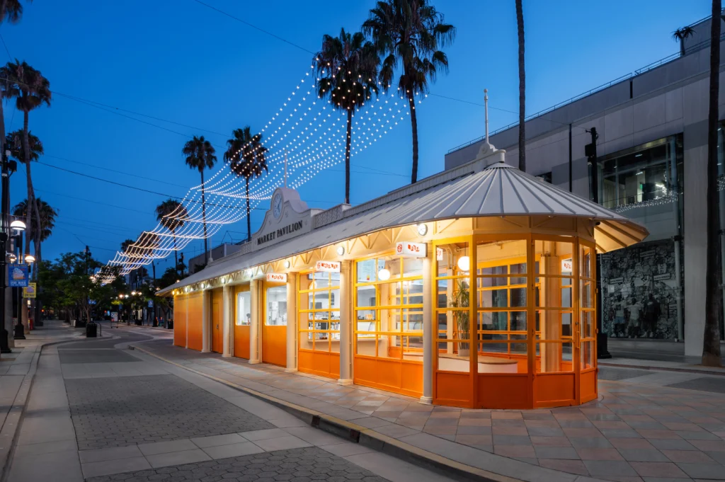
Odd One Out Tea, Santa Monica, US
WICK ARCHITECTURE & Design and Land Design Studio have collaborated to create the brand design of the Santa Monica store of Odd One Out Tea, a Taiwanese company that has taken the concept of traditional bubble tea to new heights. With two stores in Taiwan, including the company’s flagship store in Taipei, Odd One Out Tea has now opened its second US outlet in Santa Monica, California, furthering its expansion into the US market with teams of mixologists, tea experts, and gelato maestros.
The project revolved around an existing commercial space on Santa Monica’s Third Street Promenade, a popular pedestrian mall that began to flourish in the 1980s when closed off to traffic. In addition to traditional stores that line the sides of the mall, its central corridor is marked by a series of kiosk-style businesses that cater to the pedestrian flow.
The proposed colour scheme for the Odd One Out Tea store required extensive negotiations with the city before finally being approved. ‘A large part of the negotiations revolved around being able to rebrand the entire pavilion, which had not been in the mindset of the city,’ explains David Wick, principal and lead designer of Wick Architecture & Design. ‘With additional municipal restrictions on altering the roof and signage, our recommendation was that the building itself should be the sign, branded in the colours of the client’
Once approved, the designers focused on a signature move to rebrand the exterior of the structure in a colourful way, while also maintaining the existing shell of the building, including its rolling garage doors. They focused on a full redesign of its gutted interior. That included opening up the front half of the building for customers to place their orders and sit and enjoy their drinks in an open, but sheltered space.
With the existing layout of the coiling garage doors, the firm faced a challenge in terms of the placement of lighting fixtures. However, in envisioning ‘unintentional’ lighting from the onset, their design solution was to introduce simple globe lighting to attract the eye to the ordering station, but without distracting from the overall design of the space.
To convey the sense of pride that the company has in its craft preparation processes, the design team decided to expose the frontof- house production kitchen by implementing a glass divide behind the front counter. To further highlight the production zone, they punched a series of windows in the pavilion’s exterior shell to enable passers-by to take in the kitchen operations and entice them to indulge in the products being prepared. In addressing municipal restrictions concerning signage, the firm evaded any issues by designing a series of smaller rectangular blade signs that emerge from the exterior to introduce the brand.
‘We carried over some elements from the Taipei stores, including beautiful planting in the central seating area,’ explains Wick. ‘We also clad the interior ceiling in cork, which is used abundantly in Taipei, and our design produces a rich, layered effect on the ceiling under the glass of the rolled-up doors.’
‘One of the biggest challenges is that we were working with an existing envelope, and our intent was to successfully adapt that envelope to the client’s brand,’ adds Andrew Lindley, founder and lead designer at Land Design Studio. ‘It was really about the pop of the colour and the conceptual design, and we’re proud of what we accomplished here.’ www.land-la.com www.wickarch.com
9 – Project
Lumo, Dnipro, Ukraine
YOD GROUP has designed the interior of Lumo, a bright and accessible bistro on one of the central streets of Ukrainian city Dnipro.
The project was inspired by modern Italy, or rather a mix of its various cultural facets. Mosaic tiles, check patterns, and textured veneers refer to the Memphis group that revolutionised Italian design in the 1980s. The project uses Alpi veneer, the original design of which was created by the founder of Memphis, Ettore Sottsass.
The restaurant’s focal point is a rounded bar, above which a massive lamp cap rises. It resembles meringue on a cake and works as a visual magnet of the interior. Through panoramic windows, the illuminated bar can be seen from the street and square opposite the restaurant.
A typical Italian feature is the moulded cast-iron table legs, typically found in Italian coffee shops. Traditionally, they use black-fired cast iron, but the table legs at Lumo have a cold glow of polished cast iron. Another original accent is a leather canvas with raw edges. It was stretched and fixed to the round tabletops in a way that is used in the course of material preparation in Italian leather workshops.
The materials palette of Lumo includes mosaic tiles, metal, wood, and leather. The achromatic palette of the interior is broken by shades of wood, an orange strip on the floor that zones the space, and a bright red sink in the bathroom.
Rounded shapes emphasise the hospitable mood of the place, such as the shades of pendant lamps, the line of the bar counter, and a massive arch portal separating the main hall from the wardrobe and bathrooms.
Dmitry Bonesko, art director at YOD Group, says: ‘We aimed to create a high-quality and restrained design for a wide audience – a bright, friendly, open format that works right here and now. It took eight months from the idea to the restaurant launch.’ www.yod.group


